The time has officially come, the first floor renovation. It’s even strange to type, because honestly I never really thought we’d take the plunge. If I am being honest, it feels a bit indulgent. I completely understand this is a want, not need – and I definitely struggle with purchasing things out of want. BUT – it’s time. I don’t think we can paint over our kitchen cabinets with another coat of paint, 50+ years is a good run for a space. It’s time to update!
We hired Alix Home Solutions for this renovation, they came highly recommend by friends who just renovated their first floor as well. Once we met the owner, and his daughter whom is the designer we were completely smitten with their vision for our home. They understood that we did not want some extremely lavish space, we wanted it updated, functional and more than anything, too ooze coziness for a family gathering.
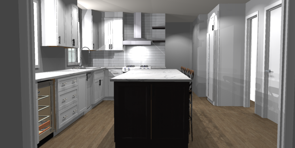
Three designs were created for us to choose from – I’ll break down the biggest differences between them. Overall, we were raising our bay window so we could run countertops underneath, AND adding a massive island.
#1 Add an island, extend the countertops – This layout raised the bay window up to be even with the kitchen sink.

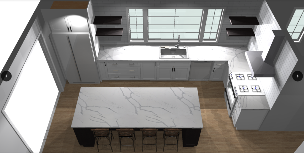
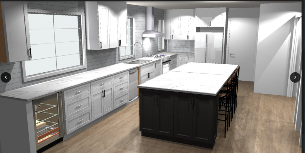
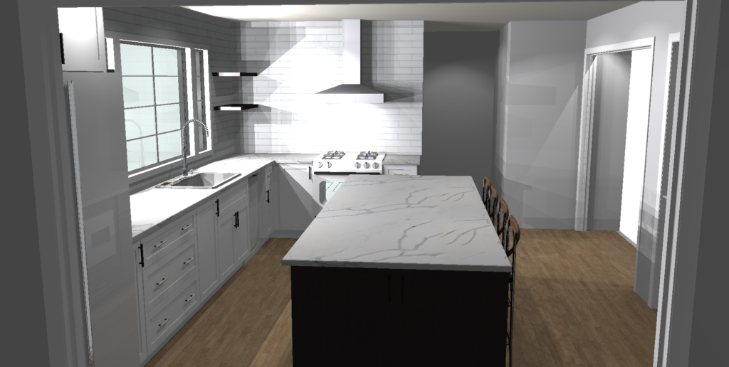
#2 Add an island, remove both bay window and sink window and create a larger scale centered window. Remove wall to dining room for more natural light.

#3 Add an island, raise bay window, maintain the rest. Omit laundry room to extend kitchen longer, and remove wall to dining room.

Can you already guess which choice we went with?!
#1 We like, but realize that eventually we’ll move the laundry upstairs and we will probably regret not opening up the dining room wall for extra light since our house is so dark.
#3 WAY too big! – I didn’t like omitting the laundry room and walking straight in from our garage door into the kitchen and not to mention the 3 windows seemed just all over the place.
So yes, #2 is the winner! We are not 100% on the details of if we’ll do shelving where they show it – we are leaning more towards an “L” layered cornered shelving to the right of the window. It was the large scale centered window that sold us – and the natural light we’ll gain from taking the wall down. Here is another angle so you can see the opening to the dining room..

Now, all the rest of the details will have to be picked! Colors, fixtures, finishes etc… SO very excited for that part! We are not that picky, and have dreamt of this space for so long I hope once we see the samples we will make quick decisions! Not to mention we are still doing the flooring throughout, the fireplace is getting completely re-faced and the stairs + railing are getting little face lift! Ahhh!! So many changes!
So exciting!!! Your kitchen is your office.. and you can indulge every once and a while! Especially on a space that gets SO much use!! This is going to be awesome!👏🏼